


The loyalty and retail product teams set out to improve foundational experiences for our customers in 2024. Applying a wider lens enabled both product and design to see where things were working and where things could be improved. One of the foundational issues that we identified was our coupons. Across our digital experiences, our coupons were too simple, didn't provide enough information, and blended in with our products.
Customer Pain Points
• Where can I find coupons?
• Which products does this coupon apply to?
• How many items does this coupon apply to?
• Is there an additional step before I can apply the coupon?
• Which coupon has been applied?
• What are the stacking rules?
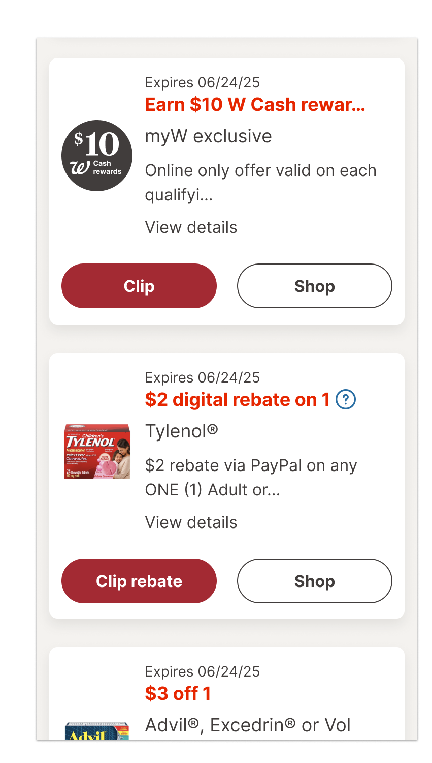
Our prior coupon designs were deceptively simple and lacked consistency. One version that’s on the Walgreens coupon hub and the product list page template masks what the customer needs to do. The card looks nearly indistinguishable from product cards. It features a drop shadow, 8px corner radius, and white interior. Even the interior composition featured a product image, description on the right and button below. The button had two states: default and clipped. The feedback was simply "Clipped".
Silos & Inconsistent Coupon Patterns
As the customer searches for coupons across both the Walgreens website and app, it can be difficult for them to distinguish between a coupon and a product card. Five years ago, I had also contributed another coupon pattern for the product details page that was much simple with a dashed line and micro animation. This component, though, was created in a silo. It's attributes were not scaled to other parts of the customer experience.
Due to past organizational silos, teams designed their own coupon patterns. Rarely did they collaborate across the retail experience from the Coupons Hub to the PDP to checkout. Significantly, the web and mobile app teams remained separate teams until 2021. This separation was reflected in the different patterns we used in our retail touch points.
A new North Star pattern
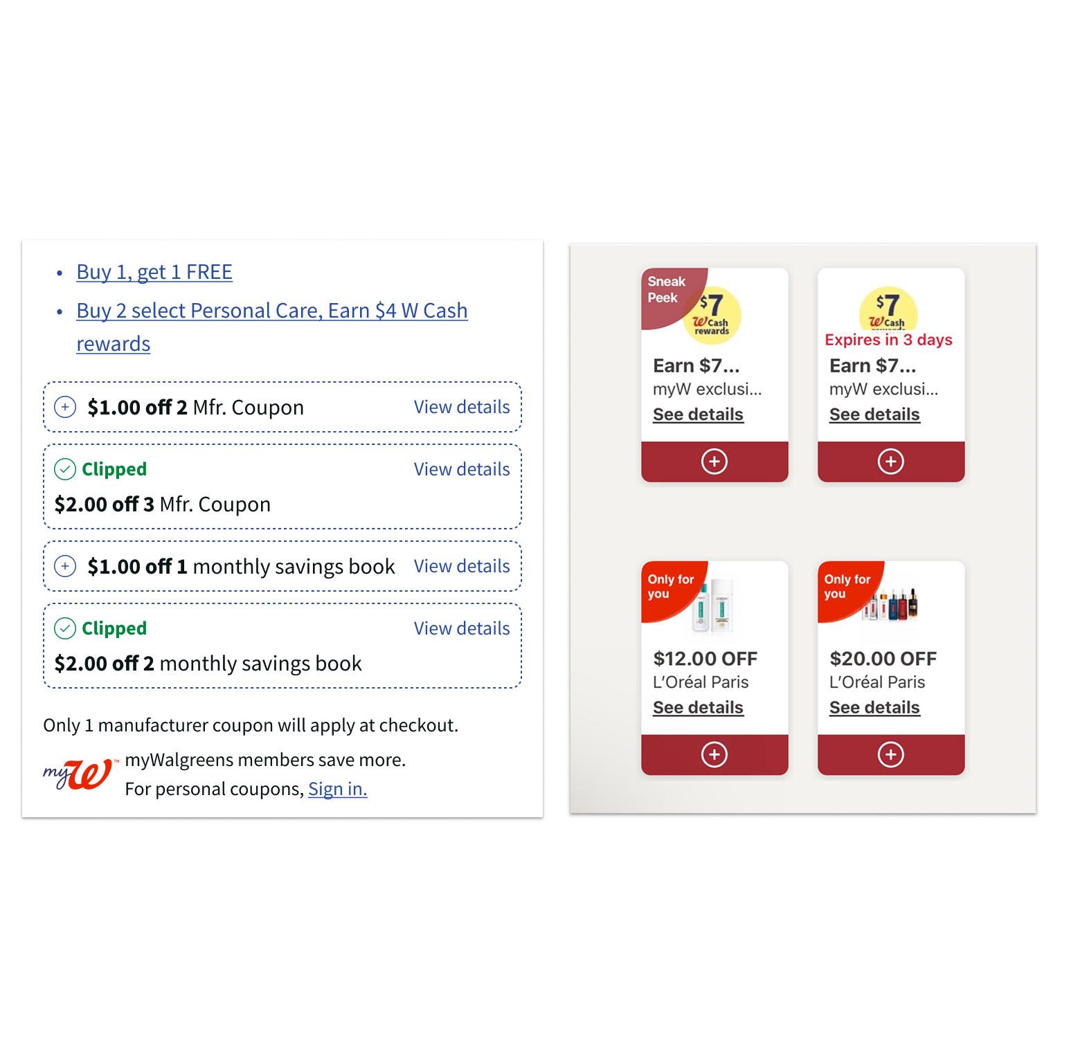
I partnered with our principal UX researcher to design a new north star design for our coupons. Throughout the experience, my copywriter partner and I consulted with our principal researcher to fix this foundational pain point. Our solution:
• Add the required number of items to the coupon's title
• Use a dash line to indicate that an activation step is required
• After activation, provide textual and visual feedback to help the customer complete the coupon requirements
• Make sure the coupon interaction and visual design complied with accessibility standards
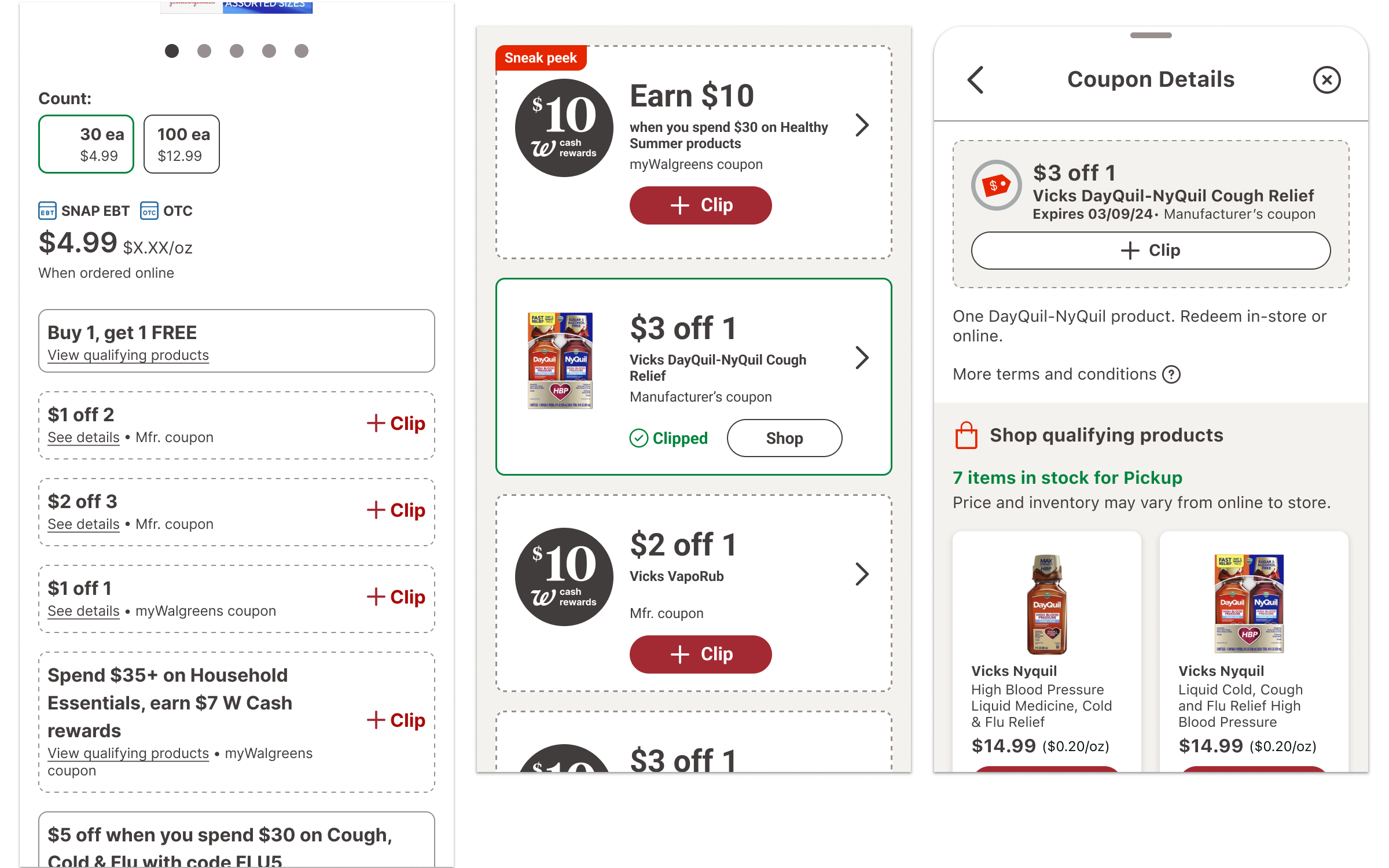
I set up a prototype to test our new designs and assumptions. The prototype began with the product detail page to test if customer could easily find and clip coupons. Then we tasked customers to meet those coupon requirements. We asked them to add item(s) to cart. If they did not meet the coupon requirements by the time they got to the shopping cart, we tested our new feedback system to see if it provided enough guidance and clarity to help customers complete their coupons. Day 1 gave us learnings to improve the new solutions. Day 2 allowed us to test the changes we made in response to testing feedback.
Scaling from web to app
My product partner made sure that our coupon data provider added the item requirement to the coupon titles. This allowed us to update all the components across both web and app. Additionally, my design colleagues and I applied our new coupon anatomy progressively through both the web and app channels.
The new PLP coupon designs were launched in Spring 2024. The shopping cart feedback system was launched at the end of fall 2024. We will assess its impact by measuring if there has been a rise in the coupon completion rate and average order size.